Thursday, March 29, 2018

Trashy Charts and I - p2


I visit various websites to collect data. Most of the sites i visit are mostly managed by various Government of India central or state departments / ministries. Given everything is digitized one realizes the extent to which this digitization has brought to light some of the issues related to quality of the websites as well as the quality of reports published.
One good thing coming out of digitization and open data is the ease of access of data collected by these ministries. When one compares the quality of data and its management with other developed countries one realizes we have a long way to go. Given it is easy to fix websites (using google search engine) and produce quality reports (using open source technologies) in this day and age i hope this effort is quicker.  Since i know a bit of R and a bit of data visualization i thought i give my 10 cents.
One common trend i find is the extensive use of pie charts.  Every report i read has a combination of pie charts, line charts and bar plots however my favorite is pie charts since they are so easy to criticize and even easier to fix.
The following pie chart is extracted from a report - Road Accidents in India 2015 published by the National Crime Bureau of India.
What did i not like about this pie chart ?
  1. background color - too dark.  Why do we need background color for this chart. a simple white or gray background does amazing job.
  2. header has a different background color . Why?
  3.  Pie has 13 sectors - It is hard to read a pie chart with so many slices. The same message is better conveyed with an ordered bar chart.
  4. The colors used to fill the slices are too similar and hence creates even more confusion. Since there are 13 slices and colors are similar its hard to know which data point corresponds to which state. For e.g. data point 8.8 and 4.2 have very similar colors.
         Screen Shot 2018-03-13 at 9.38.14 PM


Here is my transformation of the pie chart:

It just looks so much better without all that unnecessary color and large fonts.
The code for the same :

#############################
#Packages
#############################
library(ggplot2)
#############################
#data
#############################
acdt_p <- c(13.8, 12.7, 11, 8.8,7.8,6.5,4.8,4.8,4.6,4.2,2.9,2.6,2.2, 13.3)

labels <- c("Tamil Nadu", "Maharashtra", "Madhya Pradesh", "Karnataka", "Kerala", "Uttar Pradesh",
            "Andhra Pradesh", "Rajasthan", "Gujarat", "Telangana", "Chhattisgarh", "West Bengal",
            "Haryana", "Other States")

data.f <- data.frame(states= labels,value= acdt_p)
#############################
#Plot
#############################
ggplot(data.f, aes(x= reorder(states, value), y = value, fill = "value")) +
       geom_bar(stat = "identity", position = "identity") +
       geom_text(aes(label = value), hjust= 1.5)+
       scale_fill_manual(values=c("#3182bd"), guide = FALSE) +
       coord_flip()+
       labs (title = "Percentage share in Total Number of Road Accidents (2015)",
             y="percentage of share in road accidents",
             x="state",
             subtitle= "Accidental Deaths & Suicides in India",
             caption="Data Source: http://ncrb.gov.in")+
       theme_bw()+
       theme(axis.text.x= element_text(size = rel(0.9)),
             panel.grid.major = element_blank(),
             panel.grid.minor = element_blank(),
             panel.border = element_blank(),
             axis.line= element_line(colour="black"))

Government officials can simply save a template with markdown files and just replace the data as it becomes available. Not too much to ask .... ;)

Thursday, March 15, 2018

Murder cases in India - 2016

Following chart shows trend in murder cases in India by state. The advantage of using a geo facet chart is that it give a geographic location of the state. The black horizontal line in the plot corresponds to the average number of murder cases in India in 2016. This gives us a quick overview of the states where the murder cases are higher than national average and the states below the national average.
Murder Cases in India since 2010
It should be notes that the latest data available is 2016 so there is a lag of about 2 years. I have extracted the data for this plot from NCRB.  But if you like to reproduce this plot without going through the manual labor you can download the data here.
The R code used to generate the plot is here. Part of this code is inspired by Len blog.

For more information please feel free to visit my website .


Sunday, December 24, 2017

Identifying Business cycles in India

Introduction:

Many financial articles are accompanied by line charts or scatter plots that have an overlay or shaded region, as shown in the figure below.

Screen Shot 2017-12-13 at 8.52.41 PM


The main objective of shading a region is to highlight a particular time in history, or to draw the attention of the reader. In the figure below we see that the highlighted region shows the recession from the fourth quarter of 2007 to the second quarter of 2009.

The dates of recession are published by the National Bureau of Economic Research (NBER). Its actually a good practice to show the recession as it provides reader with a good perspective. For e.g. in the plot above we see that the breakeven inflation fell almost to -1% during financial crisis. So if a drop is observed again sometime after 2009 readers can easily compare.  Financial variables and economic indicators exhibited extreme behavior during crisis.

But to create a similar plot in R we need two things knowledge of how to shade regions in R and the dates of recession. So lets come to the real story how do we get business cycle dates for India. I follow a few blogs and one of them is written by Ajay Shah who has written on this topic. The article and business cycle dates for India can be downloaded here.

My aim in this post is to show readers how easy it is to create shaded regions in R using the rect() function.
gdpwith_rect.png

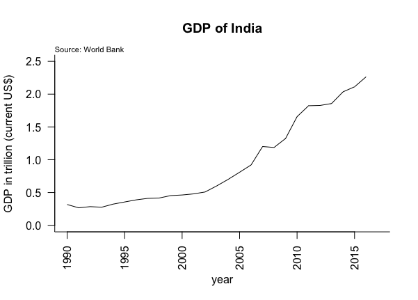
The plot above shows that GDP in India was not impacted as much by recession of 2008 and 2009. There are many reasons why this is the case and curious minds can google this. We also see that the NBER does not identify any period post 2009 as recessionary phase but we do observe slow down in India economy in the second quarter of 2011.

Packages:

For the purpose of this tutorial we will use two packages WDI and dplyr. The WDI package is used to download the data discussed in the data section. The dplyr package is used for data manipulation and transformation.

install.packages(c("WDI","dplyr"))
library(WDI)
library(dplyr)
options(scipen=999)

The install.packages() function will download the package and library() function will load the library in out current R session. The options(scipen=999) is used to instruct R that i would not like to see data in scientific notation.

Data:

We will download the data in R using the WDI package. The data is provided by World Bank via World Development Indicator. To learn more about the indicators, country codes, frequency of data etc, please visit their website. For the purpose of this tutorial we will download the GDP data from 1990 to 2017.

## extract GDP data 
gdp = WDIsearch(string = "gdp", field = "name", short = TRUE,
                                 cache = NULL)
data = WDI(country = "IN", indicator = "NY.GDP.MKTP.CD",
 start = 1990, end = 2017, extra = FALSE, cache = NULL)

The WDIsearch() function is used to search for all the data made available by World Bank.  The first argument in this function is a string which can be anything you like search. In our case we would like to search for the GDP data but we could have also replaced string ="gdp" to string ="unemployment" or string="gender". What we would get back is a list of  indicators and their names. We need to know the indicator to download the data.

Now to extract the data we will use the WDI() function from WDI package. The first argument is country. In our case we would like the data for India hence "IN" , note that if you like to know the code of your country you can go to the WDI website and get the code or type country ="all" instead of country ="IN". The next argument is the indicator, this where we will use the indicator from the gdp data frame. The start and end date should also be specified.

 Data transformation:

I would not like to plot the actual GDP data but somehow shorten the number so that its easily readable on the Yaxis. So we will divide the gdp data by 10^12 and then sort the data.

data= mutate(data, gdp = NY.GDP.MKTP.CD/10^12)
data = arrange(data,year)

The mutate() function will create an additional column with the transformed data. the first argument in the mutate function is data, the second argument is the transformation we would like to see. Here, we will divide the data by 10^12.  Next , we will arrange the data from 1990 to 2017 using the arrange() function. The first argument in arrange() function is the data and the second argument is the name of column we would like to sort in descending order.

Creating a line chart and adding a shaded region:

    gdp
Following line will create a line plot:

plot(data$year,data$gdp, type ="l", las = 2, bty="l", 
                         ylim=c(0,2.5),main = "GDP of India", 
                         ylab = "GDP in trillion (current US$)", 
                        xlab = "year")

In this post the aim is not plot a line chart but create a shaded region. To create a shaded region we need the business cycle dates for India. Now, we know business cycle dates from Ajay Shahs blog. Since, we are only going to plot recession we only need recession dates. India under went recession three time since 1990, following are the recessionary dates:
  • 1999 quarter 4 to 2003 quarter 1
  • 2007 quarter 2 to 2009 quarter 3
  • 2011 quarter 2 to 2012 quarter 4
To plot three separate recession we will need three separate rectangles. We can create rectangles using the following lines:

rect(1999.75,-1,2003.25,2.5,col = rgb(211,211,211,100,max=255), border = FALSE)
rect(2007.50,-1,2009.75,2.5,col = rgb(211,211,211,100,max=255), border = FALSE)
rect(2011.50,-1,2013,2.5,col = rgb(211,211,211,100,max=255), border = FALSE)

the rect() function in R will create a rectangle on the chart. To create a rectangle we usually need the base and the height. similarly, in R the rect() function has four arguments:

The first argument is the xleft, which mean the starting point on the xaxis from where we would like to draw a rectangle. The second argument is ybottom, this is the point on the yaxis. Both the xleft and ybottom will be a point on the plot.The third argument is xright, which is the right most point. So we have the base ready. All we need is a height. The fourth argument is ytop, this is the point on the yaxis corresponding to the xright.

To plot the first recession we will run the following code:

rect(1999.75,-1,2003.25,2.5,col = rgb(211,211,211,100,max=255), border = FALSE)

In the above code the xleft is 1999.75 which is the third quarter of 1999, -1 is used for ybottom. If we do not use -1 the rectangle will have a space between xaxis and base of rectangle. The xright argument is 2003.25 as the recession ends in first quarter of 2003 and finally ytop argument which is 2.5. I picked 2.5 based on the max value of gdp.
We will repeat the above mentioned code for the remaining two recession periods. Finally, we will use the col argument to fill the rectangle with colors and border = FALSE argument will not create a border around the rectangle.
One important point to remember is that the rectangle is created on top of the line chart. Hence, we need to make the rectangle transparent so that we can see the line representing GDP. One very useful trick in R is to use the rgb() function which has an argument for alpha. The alpha argument controls the transparency, i played around with this value till i was happy with the result. To learn more about the rgb() function type ?rgb in R console window.

Conclusion:

In the current post we learned to create a rectangle and overlay it on line plot in R to show recession phases. We see that adding shaded region on the line plot adds context and we can increases the interpretability of a plot.

Code:

Please leave a comment if you find issues with the code.

library(WDI)
library(dplyr)
options(scipen=999)
## extract GDP data 
gdp = WDIsearch(string = "gdp", field = "name", short = TRUE,
 cache = NULL)
data = WDI(country = "IN", indicator = "NY.GDP.MKTP.CD",
 start = 1990, end = 2017, extra = FALSE, cache = NULL)
## convert data into trillion and arrange it
data= mutate(data, gdp = NY.GDP.MKTP.CD/10^12)
data = arrange(data,year)

#picking color
col.rgb = col2rgb("lightgrey")
print(col.rgb)

## generate the plot
plot(data$year,data$gdp, type ="l", las = 2, bty="l", ylim=c(0,2.5),main = "GDP of India", ylab = "GDP in trillion (current US$)", xlab = "year")
mtext("Source: World Bank",3, adj = 0, outer=FALSE, cex=0.7)
rect(1999.75,-1,2003.25,2.5,col = rgb(211,211,211,100,max=255), border = FALSE)
rect(2007.50,-1,2009.75,2.5,col = rgb(211,211,211,100,max=255), border = FALSE)
rect(2011.50,-1,2013,2.5,col = rgb(211,211,211,100,max=255), border = FALSE)

Sunday, January 1, 2017

Gender Wage Gap in Australia

Gender Wage Gap in Australia
Please feel free to learn about the plot was generated in R posted on my website - atmajitgohil.com.


Friday, December 30, 2016

Slope Charts in R

slope graphs

Slope Chart

Introduction:

This post is once again inspired by the week 52 challenge of Makeover Monday. We will use the data provided to generate a slopegraph in R. Slopegraph have been widely applied as medium of visualization. Slope charts are primarily used to compare two or more categories of data between different time periods.Schwabish [1] recommends using slope charts as an alternative to using multiple pie charts for comparing two different time frames as shown in the figure below:

par(mfrow=c(1,2))
p1962= c(16,30,28,15,3,6)
lbl1962=c("a","b","c","d","e","f")
pie(p1962, labels=lbl1962, main ="share in 1962")
p2007=c(36,29,16,9,8,3)
lbl2007=c("a","b","c","d","e","f")
pie(p1962, labels=lbl2007, main = "share in 2007")

Andy Kirk [4]“The typical application for using a slopegraph is for a before and after story. Its key value is that it provides several lines of interrogation in one single chart, revealing ranking, magnitude and changes over time.”

Following are some of the applications of Slope charts -

  • New York Times [3] have employed Slopegraphs to show percentage of each country that is foreign born migrant.
  • New York Times [4] have employed Slopegraphs to show change in Infant Mortality Rate between 1960 and 2004. The slope of the line is a good indicator of how a country performed over 44 years.

Data:

The data for the slopegraph is provided by the Mondaymakeover in XLS format. The data can be downloaded from the website by going to the data section and week 52. The data file comprises of prices for 20 grocerry items for a time period 2006 until 2016. We will use data for 2006 and 2016 to show the magnitude of price change for various groceries.

Plot:

The code used to generate the plot is very easy to understand. We will discuss the same under the section generating the slope chart in R.

## Warning: package 'plotrix' was built under R version 3.2.3
## Warning: package 'dplyr' was built under R version 3.2.5

We have used two different colors to show the positive and negative growth in prices between 2006 and 2016. Note that the grocery items are listed under 2006 and 2016 based on their ranking in each year. A quick look at the chart reveals that the most expensive items in 2006 and 2016 were hams, whiskey, crackers and turkey. We also observe that prices for ham and crackers fell from 2006 to 2016 and that of whiskey and turkey rose.

Also, the rank of beer fell from 2006 to 2016. The color indicates that the price of beers fell which is the primary reason the beers were ranked 10 in 2016 whcih was 5 in 2006.

Generating a Slope Chart in R:

Getting Ready:

We will install and use the plotrix library in R to generate the slopegraph. Further, We will install and use the dplyr library for a little bit to data manipulation.

library(dplyr)
library(plotrix)

Importing data and calculating a growth field:

We will import the data in R using the read.csv() function and add a new column growth using the mutate() from dplyr library. Finally, we create a new data set using the columns 2006 and 2016.

infl = read.csv("christmas_dinner_prices.csv")[-21,]
infl= mutate(infl, growth=((infl[,12]-infl[,2])/infl[,2])*100)
infl.plt=cbind(infl[,2], infl[,12])

Generating the Slope Graph:

The slope chart in R can be craeted quickly using the bumpchart() function from the plotrix library. To learn more about additional arguments used in the bumpchart type ?bumpchart in the R consol window.

rownames(infl.plt)=infl[,1]
colnames(infl.plt)=c("Rank in 2006","Rank in 2016")
bumpchart(infl.plt, mar =c(2,8,5,12), col=ifelse(infl$growth>0,"#8c510a","#01665e"), main ="Cost of a Christmas Dinner")

Custom Function to fix the label size:

The default slope chart generated in R does not allow us to alter the label sizes. We can fix this issue by writting our own function. We will simply use the code from bumpchart() function and simply edit the text() within bumchart function by adding an argument cex=0.5.

In order to view the code that generates the default slope chart simply type bumpchart in the R console window. Copy this code into a new R script window and edit the text() functions. Save and source this newly created function. Regenerate the slope chart again using this new function. The function that allows us to fix the label sizes is provided under the section Custom Function Code.

The following code can be used to generate the same slope chart but now with smaller labels.

bmp(infl.plt, mar =c(2,8,5,12),cex=.5,col=ifelse(infl$growth>0,"#8c510a","#01665e"),main ="Cost of a Christmas Dinner")

I generated the slope chart and added the legends using inkscape.

Custom Function Code:

bmp= function (y, top.labels = colnames(y), labels = rownames(y), 
          rank = TRUE, mar = c(2, 8, 5, 8), pch = 19, col = par("fg"), 
          lty = 1, lwd = 1, arrows = FALSE, ...) 
{
  if (missing(y)) 
    stop("Usage: bumpchart(y,top.labels,labels,...)")
  ydim <- dim(y)
  if (is.null(ydim)) 
    stop("y must be a matrix or data frame")
  oldmar <- par("mar")
  par(mar = mar)
  if (rank) 
    y <- apply(y, 2, rank)
  labels <- rev(labels)
  pch = rev(pch)
  col = rev(col)
  lty = rev(lty)
  lwd = rev(lwd)
  y <- apply(y, 2, rev)
  if (arrows) {
    matplot(t(y), ylab = "", type = "p", pch = pch, col = col, 
            axes = FALSE)
    for (row in 1:(ydim[2] - 1)) p2p_arrows(rep(row, ydim[1]), 
                                            y[, row], rep(row + 1, ydim[1]), y[, row + 1], col = col, 
                                            lty = lty, lwd = lwd, ...)
  }
  else matplot(t(y), ylab = "", type = "b", pch = pch, col = col, 
               lty = lty, lwd = lwd, axes = FALSE, ...)
  par(xpd = TRUE)
  xylim <- par("usr")
  minspacing <- strheight("M") * 1.5
  text(1:ydim[2], xylim[4], top.labels)
  labelpos <- spreadout(y[, 1], minspacing)
  text(xylim[1], labelpos, labels, adj = 1,cex=0.5) # added cex for labels
  labelpos <- spreadout(y[, ydim[2]], minspacing)
  text(xylim[2], labelpos, labels, adj = 0,cex=0.5) # added cex for labels
  par(mar = oldmar, xpd = FALSE)
}