One good thing coming out of digitization and open data is the ease of access of data collected by these ministries. When one compares the quality of data and its management with other developed countries one realizes we have a long way to go. Given it is easy to fix websites (using google search engine) and produce quality reports (using open source technologies) in this day and age i hope this effort is quicker. Since i know a bit of R and a bit of data visualization i thought i give my 10 cents.
One common trend i find is the extensive use of pie charts. Every report i read has a combination of pie charts, line charts and bar plots however my favorite is pie charts since they are so easy to criticize and even easier to fix.
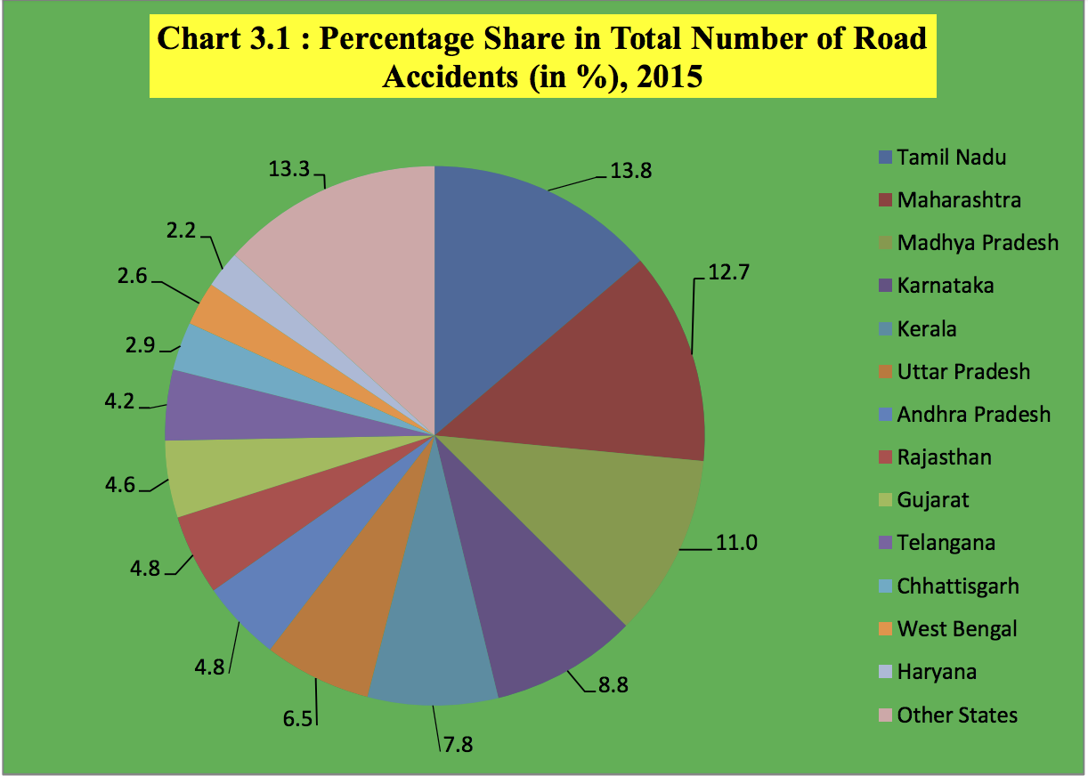
The following pie chart is extracted from a report - Road Accidents in India 2015 published by the National Crime Bureau of India.
What did i not like about this pie chart ?
- background color - too dark. Why do we need background color for this chart. a simple white or gray background does amazing job.
- header has a different background color . Why?
- Pie has 13 sectors - It is hard to read a pie chart with so many slices. The same message is better conveyed with an ordered bar chart.
- The colors used to fill the slices are too similar and hence creates even more confusion. Since there are 13 slices and colors are similar its hard to know which data point corresponds to which state. For e.g. data point 8.8 and 4.2 have very similar colors.
Here is my transformation of the pie chart:

The code for the same :
#############################
#Packages
#############################
library(ggplot2)
#############################
#data
#############################
acdt_p <- c(13.8, 12.7, 11, 8.8,7.8,6.5,4.8,4.8,4.6,4.2,2.9,2.6,2.2, 13.3)
labels <- c("Tamil Nadu", "Maharashtra", "Madhya Pradesh", "Karnataka", "Kerala", "Uttar Pradesh",
"Andhra Pradesh", "Rajasthan", "Gujarat", "Telangana", "Chhattisgarh", "West Bengal",
"Haryana", "Other States")
data.f <- data.frame(states= labels,value= acdt_p)
#############################
#Plot
#############################
ggplot(data.f, aes(x= reorder(states, value), y = value, fill = "value")) +
geom_bar(stat = "identity", position = "identity") +
geom_text(aes(label = value), hjust= 1.5)+
scale_fill_manual(values=c("#3182bd"), guide = FALSE) +
coord_flip()+
labs (title = "Percentage share in Total Number of Road Accidents (2015)",
y="percentage of share in road accidents",
x="state",
subtitle= "Accidental Deaths & Suicides in India",
caption="Data Source: http://ncrb.gov.in")+
theme_bw()+
theme(axis.text.x= element_text(size = rel(0.9)),
panel.grid.major = element_blank(),
panel.grid.minor = element_blank(),
panel.border = element_blank(),
axis.line= element_line(colour="black"))
Government officials can simply save a template with markdown files and just replace the data as it becomes available. Not too much to ask .... ;)
